When scrolling through Facebook, you’ve probably seen some posts that immediately catch your eye, while others are easily scrolled past. The factor that makes the difference is not just the content, but also the size and quality of the images. On a platform where visuals determine engagement, choosing the right image ratio is extremely important. So, between 9:16, 1:1, or 4:5, which is the optimal choice? In this article, Optimal Agency will analyze each image ratio in detail and share how we apply them to create images that are both standard and captivating. Let’s explore!
When you partner with Optimal Agency, you will be provided with high-quality, stable, and reputable Agency ad accounts – which have been proven effective through many campaigns, even in difficult industries like cosmetics, finance, and tobacco. In addition, our flexible and transparent account rental policy, from top-up fees to ad invoices, ensures that you can manage your spending clearly and optimize your effectiveness in each campaign.
We own a powerful Facebook ad account system with a variety of time zones, currencies, and countries, which meets the needs of running campaigns with large budgets. In particular, we provide premium account types like Invoice Facebook, BM5000, etc., which help advertisers confidently scale up.
Image sizes that Facebook recommends
To ensure your images are always sharp, professional, and attract customer attention, Facebook has provided specific recommendations for image sizes. When we work with clients, we find that just by adjusting the image to the standard size, campaign effectiveness can increase significantly. Here are some important sizes that you need to know:
Standard post image
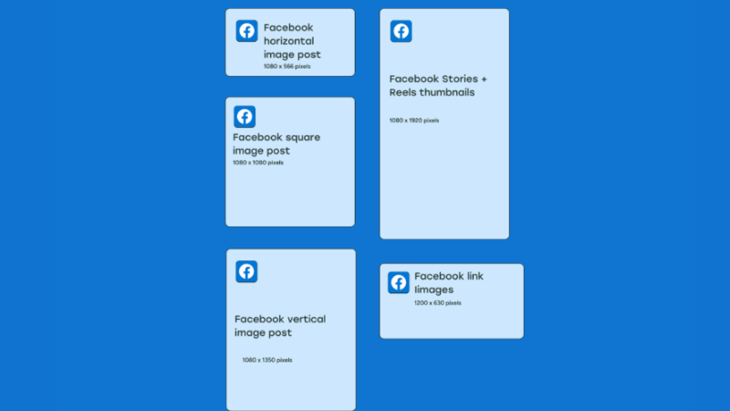
When we work with clients, one of the most common errors is posting an image with the wrong size, which causes the image to be pixelated or look unprofessional. Facebook recommends 1,200 x 630 pixels for a post image. With this size, the image will be sharp on both desktop and mobile. For example, if you share a link to a blog or a product page, using a standard-sized image will make the post look much more trustworthy and appealing.
Profile Picture
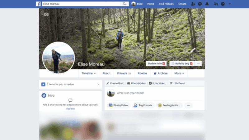
The profile picture is the “brand’s face” on Facebook, and we always advise advertisers to invest in making it perfect. The ideal size is 1,000 x 1,000 pixels. However, remember that Facebook will crop the image into a circle, so you should place the logo or face right in the center. For example, a cosmetics brand once had a logo that was placed off-center, and when it was displayed on mobile… half of the text was missing!
Cover Photo
The cover photo is like a giant billboard right on the Fanpage. The recommended size is 1,640 x 620 pixels. We often suggest that clients place their slogan or CTA (Call to Action) in the center because the top and bottom edges can be cut off on some devices. For example, a spa can place the phrase “Book your appointment today and get 20% off” right in the middle of the cover photo, ensuring the message always stands out.
3 Factors to ensure for images when running Facebook Ad posts
When running ads, many of you often focus only on the content and the budget, but forget that the image is the first thing that catches a customer’s eye. If the image does not meet the standards for size, format, and quality, it will be very difficult for the ad to attract attention, and it may even be rejected by Facebook. So, what do we need to ensure that the images are displayed beautifully and effectively?
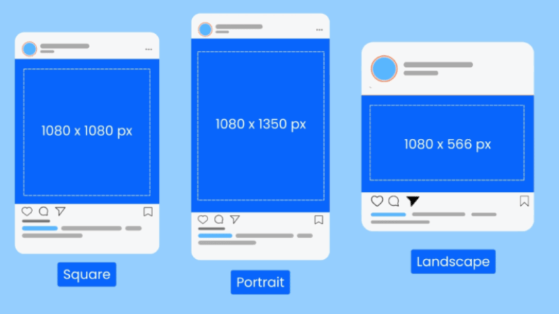
Image size
We often remind our clients that the standard image size is the “gateway” for ads to be displayed beautifully. If the image is too small, the content will be pixelated or blurry when enlarged. For example, when running a promotion post, an image of only 600×600 px will have blurry edges and will be less attractive than a competitor’s sharp 1080×1080 px image. Therefore, you should always ensure that your images are at a minimum of 1080×1080 px to make an impression at first glance.
Image format
We advise you to prioritize JPEG or PNG because these are the two optimal formats that Meta supports best. Although the platform accepts some other formats, in reality, they are more prone to display errors or can even be rejected. For example, a client once sent us a TIFF file to run ads, and the system immediately reported an error. However, when we switched to JPEG, the ad ran smoothly. Current free image conversion tools all support PNG/JPEG, so don’t make it difficult for yourself with unnecessary formats.
Image quality
In a competitive environment like Facebook, your ad will appear right next to a lot of other content. If the image is blurry, dark, or not sharp, users will easily skip it. We often remind our clients: a quality image is the “hook” that drives clicks to the post. For example, when promoting a fashion product, using a sharp 2K image not only highlights the details of the material but also increases the brand’s professionalism. Therefore, always choose a high-resolution image so that your ad is not “outshone” by your competitors.
Standard Facebook ad post image size for 2025
Before you start designing images for running ads, new advertisers need to know the standard image sizes for ads. The reason is that if you choose the wrong ratio, important details of the content may be cropped, which will significantly reduce the effectiveness of the campaign.
Common sizes in Facebook/Instagram Advertising
When running ads, we often advise you—especially new advertisers—to be familiar with a few basic image sizes:
- 1080×1080 (square): This is the safest format because it displays well in most places, from the News Feed to Instagram.
- 1080×1920 (vertical): Suitable for Instagram Stories or Reels on Facebook ads, where users scroll vertically more often.
- 1080×566 (horizontal): Suitable for some specific placements, such as when you want the image to appear as a horizontal banner.
For example, if you own a fashion store, a square image will help your product display clearly on both Facebook and Instagram. But if you are running ads for a fitness service, the vertical format gets “bonus points” in Stories and Reels because it creates a feeling of intimacy and fills the screen.
Problems with cropping images and how to fix them
A situation that many advertisers face is that an image with text or important details is cropped when displayed in different placements. The good news is that Facebook now has AI technology that automatically “bleeds” color into the empty spaces, like the black bars when watching a widescreen movie. This helps the image display more naturally.
In addition, we often proactively design separate images for each placement or turn off Advantage+ Placements to manually choose the appropriate placement. For example, if an image is only suitable for the vertical format, we will only allow the ad to run on Instagram Stories/Reels instead of all placements.
Which image works best?
In reality, there is no fixed formula. If someone claims that there is an image format that “always works,” that’s just a way to attract viewers. The important thing is to test continuously.
A small tip that we apply: use the Meta Ads Library to see what images your competitors are running. However, remember that just because you see a competitor running an ad doesn’t mean it’s effective. A simple sign is that if an ad is maintained for many months, there’s a high chance that it’s an image that is bringing in good results.
For example, A cosmetics brand we follow has a simple ad creative with a product placed on a white background. Although it looks very ordinary, that ad has been running continuously for over 6 months—proving its real effectiveness.
The process of effective image testing
In our campaigns, image testing is always our top priority. For example, the client Football Fun Factory launched with 10 different images and videos. After a while, Facebook AI automatically allocated more budget to the images that were bringing in the best results. I will remove the images with a low budget and only leave 3-4 images to “survive,” and the rest are removed.
From the most effective images, we continue to create more variations for a new round of testing. Sometimes, the results are very surprising: a video that seemed “nothing special” remained effective for 18 consecutive months because it hit the right customer insight.
Guide to choosing the optimal image size for each Facebook ad placement
We believe that in the past, many advertisers chose the simple approach of just creating one square image and using it for all ad placements. This was partially true, as a square image (1080×1080) takes up a lot of display space and was therefore considered the “standard” for a long time. But now, with the variety of placements (Feed, Stories, Reels, Marketplace, etc.), using a single size is no longer effective enough. If the image is not customized, the ad will look awkward, the text will be small, or it will lose its natural look in the user’s experience.
When you only keep the square image, Facebook will automatically add a border or background in Stories. It looks okay, but it clearly doesn’t blend in with the user’s content stream. Instead, we need to design the image to look like a part of the native content. For example, Shopify optimizes images very well with clear, easy-to-read text, while some other brands have text that is too small, which makes the ad less appealing.
How to optimize image sizes
We usually advise you to start with tools like Canva or Photoshop. You should:
- Create a standard Instagram Post square image (1080×1080).
- Use the Resize feature to turn it into 1080×1920 (Stories, Reels) or 1920×1080 (Horizontal Video).
- When you resize, you don’t need to redesign from scratch; just adjust the layout so that the content looks more natural.
Specific examples:
- For Stories (9:16): Spread the text and images to fill the entire screen instead of placing them in the center.
- For Horizontal (16:9): Take advantage of the horizontal space to add a prominent CTA.
Suggested sizes for each placement
- 1:1 (square): Feed, Right Column, Search.
- 9:16 (vertical): Stories, Reels.
- 16:9 (horizontal): In-stream, Marketplace.
Best practices to make images stand out
- Use bright colors and clear, easy-to-read text.
- Keep the design native to each placement, so the ad “looks like native content.”
- Be consistent with fonts, colors, and styles to make it easy to measure effectiveness.
When we optimized images for each ad placement, we saw many campaigns with improved CTR and a clear reduction in costs. Users will feel like the ad “blends in” with their content stream, which increases the likelihood of engagement and conversion.
Knowing and correctly applying the standard Facebook ad post image size will help advertisers optimize their display, increase engagement rates, and create a more professional impression in the eyes of customers. Invest the time to prepare your images to the standard size from the beginning—that’s the key to your ad campaign achieving the highest effectiveness.
Frequently Asked Questions
You need to choose the appropriate size depending on the type of post. Some common Facebook post types include:
For a vertical rectangle image, you should maintain a size of 900×1200 pixels. For a square image, the ideal size is 900×900 pixels. For a horizontal rectangle image, the size should be 1200×900 pixels.
The image format should be JPG or PNG, with an image ratio from 16:9 to 19:6, and the most standard Facebook ad banner size is 1200×628 pixels.
In addition, there are some other display styles, including: 4 squares, a large horizontal image with 3 small squares below, or a large vertical image with 3 small squares next to it.
When you design a Facebook ad image, you should make sure that a square image is 900×900 pixels. If you want a horizontal image, the standard image size should be 1200×600 pixels.